Shine On: Color Strategies for Reflecting Natural Light

Chosen theme today: Color Strategies for Reflecting Natural Light. Explore palettes, finishes, and layout choices that bounce daylight deeper into every corner. Share your trickiest room in the comments and subscribe for weekly, light-smart color inspiration.

How Light Meets Color: The Essentials

Every color carries a hidden temperature. Warm undertones can soften blue daylight; cool undertones can crisp up golden sun. Hold swatches near fixed elements and natural light sources to spot shifts. Comment your undertone questions below.

How Light Meets Color: The Essentials

LRV measures how much light a paint color reflects, typically on a 0–100 scale. Higher LRV colors bounce more daylight, brightening walls and ceilings. Pair medium-LRV walls with high-LRV trim to amplify reflection. Save our LRV tips and subscribe.
North light is steady but cool, often flattening colors. Choose warm, creamy neutrals with higher LRV to bounce limited daylight and add softness. Gentle peach-beige or warm greige revives depth. Share your north-facing room photos for suggestions.

Orientation Playbook: Matching Colors to Sun Paths

South light is abundant, so color can read brighter. Use nuanced off-whites or muted pastels to reflect natural light while reducing glare. Cool undertones can calm midday heat. Subscribe for our south-room palette cheat sheet and tester checklist.

Orientation Playbook: Matching Colors to Sun Paths

Surfaces That Bounce: Paint, Materials, and Sheen

A nuanced white with a compatible undertone reflects light without feeling cold. Aim for LRV in the high 70s to 80s on walls, and brighter on ceilings. Sample generously. Share your short list and we’ll help pick a harmonious white.

Surfaces That Bounce: Paint, Materials, and Sheen

Place mirrors opposite or adjacent to windows to bounce daylight deeper. Choose brushed metals for softer reflection, polished for sparkle. Glass tabletops amplify brightness. Post your layout sketch and we’ll suggest mirror sizes and placement tips.

Contrast and Accents that Amplify Brightness

Contrast creates visual hierarchy. Pair soft, light walls with slightly brighter trim to frame openings and reflect natural light along edges. Add a deeper anchor on one wall to make adjacent planes feel luminous. Share your floor plan for suggestions.

Contrast and Accents that Amplify Brightness

Use a higher-LRV, slightly cooler white on trim and ceilings to act like light ledges. This subtle shift bounces daylight, sharpening lines and lifting ceilings. Post your current trim paint and we’ll suggest a brighter, compatible upgrade.

Testing Like a Pro: Samples, Photos, and Feedback

Big Swatches on Boards, Moved Around

Paint large sample boards, not tiny chips. Move them across walls, near windows, and behind furniture. Watch how undertones shift with natural light angles. Keep notes. Share time-stamped observations for personalized, data-driven advice.

Photograph the Room, Compare Across Time

Take photos morning, midday, and evening with the same settings. Compare how reflection and color balance change. Look for hotspots or dull corners. Post your comparison grid; we’ll help optimize placement and sheen for even daylight.

Invite Opinions, But Trust Intent

Crowd feedback can surface issues you missed, yet your goals matter most. Recheck how each candidate reflects light and supports function. Save finalists for a week. Comment your final two picks and we’ll help break the tie.

Avoiding Pitfalls: Glare, Washout, and Color Casts

The All-White Trap

Ultra-bright whites everywhere can create glare and flatten texture. Soften walls with a nuanced off-white while keeping ceilings and trim brighter. This preserves reflection without eye strain. Share your white shortlist for undertone and LRV guidance.

Undertone Clashes with Fixed Elements

Countertops, floors, and tiles cast color. A cool white against warm marble can look sour; warm beige near cool concrete may turn muddy. Align undertones so reflected light reads harmonious. Upload reference photos for undertone alignment tips.

Ignoring Texture and Pattern

Smooth surfaces reflect sharply; textured weaves diffuse softly. Too many glossy planes can feel sterile. Mix matte textiles with selective sheen to balance reflection. Comment your favorite textures, and we’ll recommend complementary paints and finishes.

Seasonal and Climate Smarts

Low winter sun can look cooler; high summer sun can wash colors out. Balance with warm undertones in winter-prone spaces and moderated contrast for summer glare. Share your latitude for seasonal palette fine-tuning and scheduling tips.

Seasonal and Climate Smarts

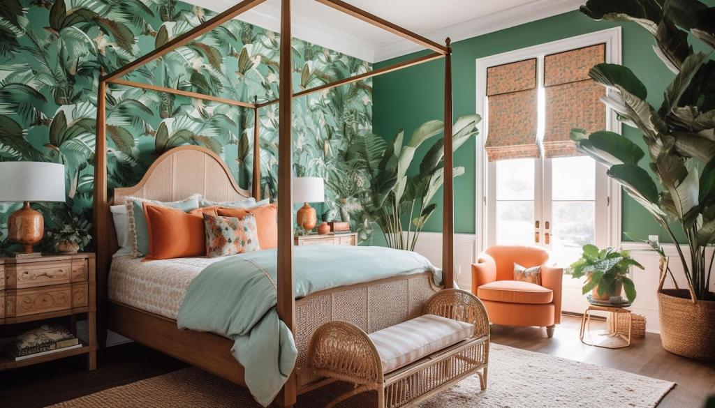
Moist air and bright skies can intensify blue light. Use slightly warmer whites and corrosion-resistant reflective accents. Linen sheers manage glare while preserving bounce. Post your coastal room photos for humidity-friendly finishes and fabric suggestions.
Ateljeed
Privacy Overview

This website uses cookies so that we can provide you with the best user experience possible. Cookie information is stored in your browser and performs functions such as recognising you when you return to our website and helping our team to understand which sections of the website you find most interesting and useful.